LOGO
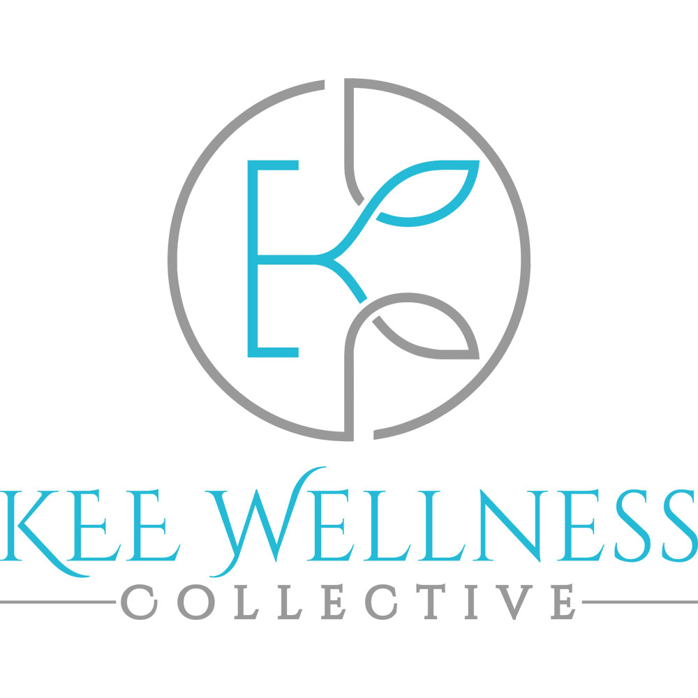
This is a very long name. That’s always a challenge. But we were up for it.
In addition to its length the acronym “KEE” in unclear (hint: those are the initials of the three founders first names).
Building off the company’s holistic origins we translated natural growth represented by the leafy shapes. Adding calming colors seemed logical. If you look closely you’ll see “K” and “E” in the icon.